Typeface
Corbusier
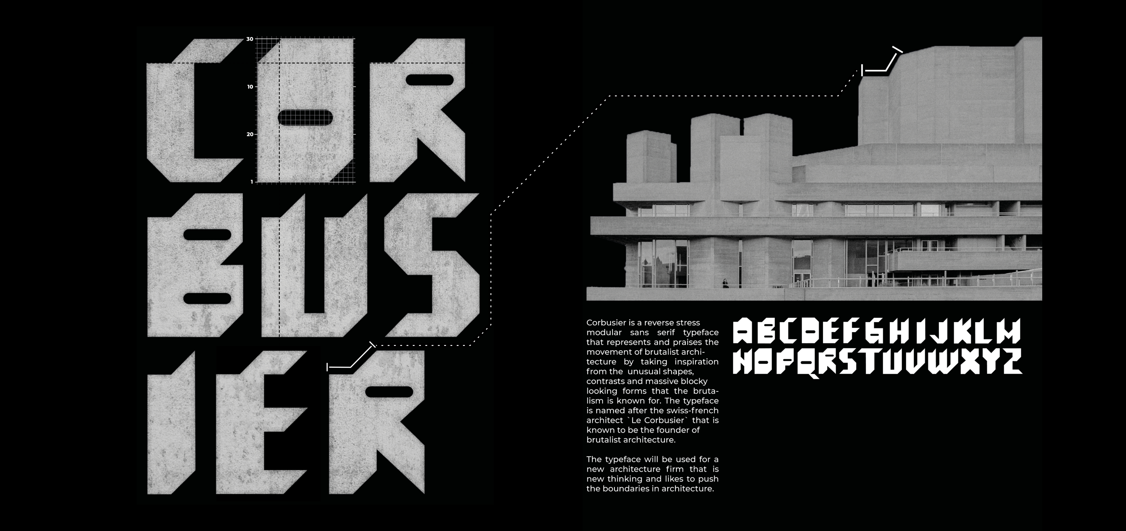
Brutalism, also known as Brutalist architecture, is a style that emerged in the 1950s and grew out of the early 20th century modernist movement. Brutalist buildings are characterized by their massive, monolithic, and ‘blocky’ appearance with a rigid geometric style and large-scale use of poured concrete. The movement began to decline in the 1970s, has been much criticized for being unwelcoming and inhuman. But it`s a beauty in it and a utopian vibe to the buildings. A freedom to experiment with geometric shapes to provoke and challenge the normal.
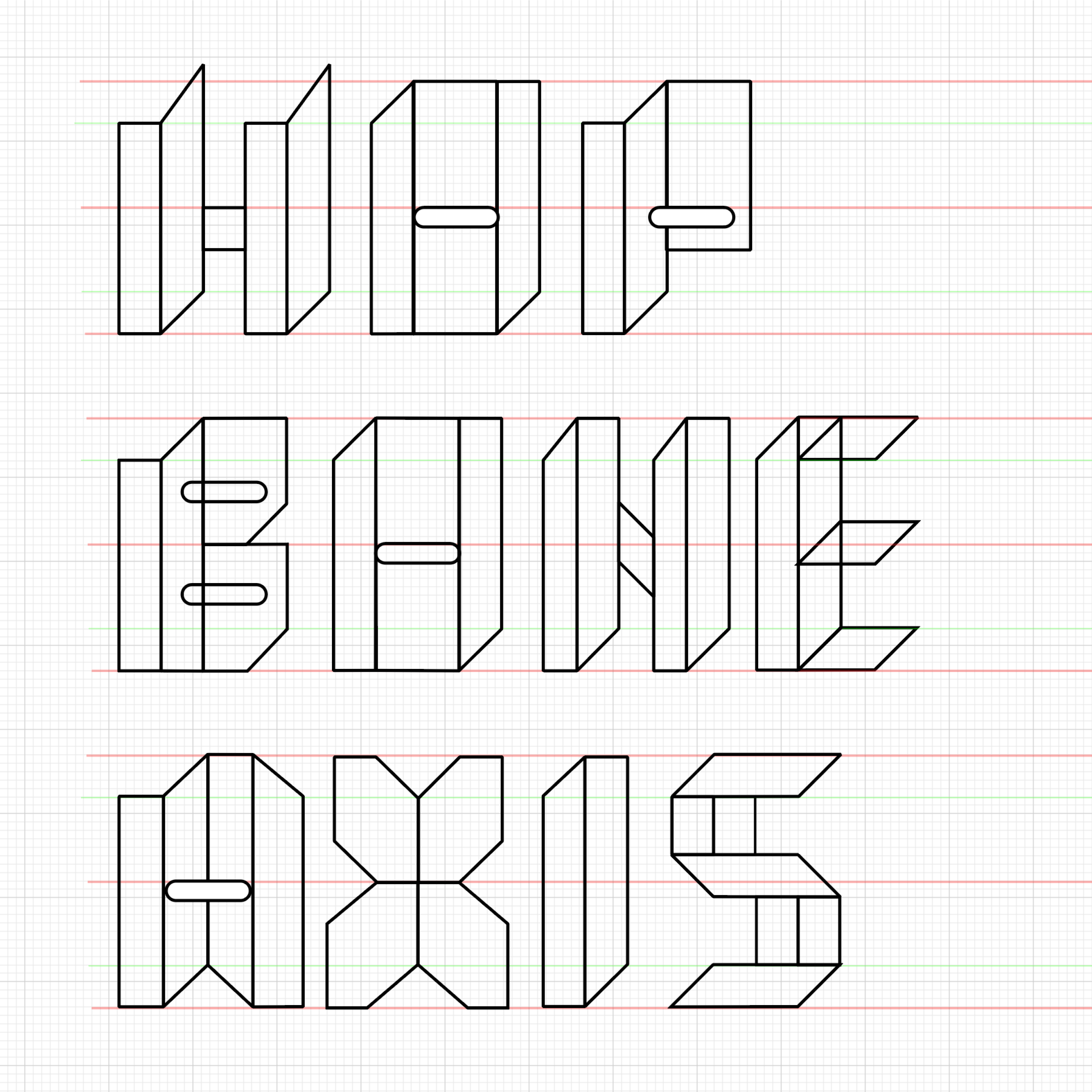
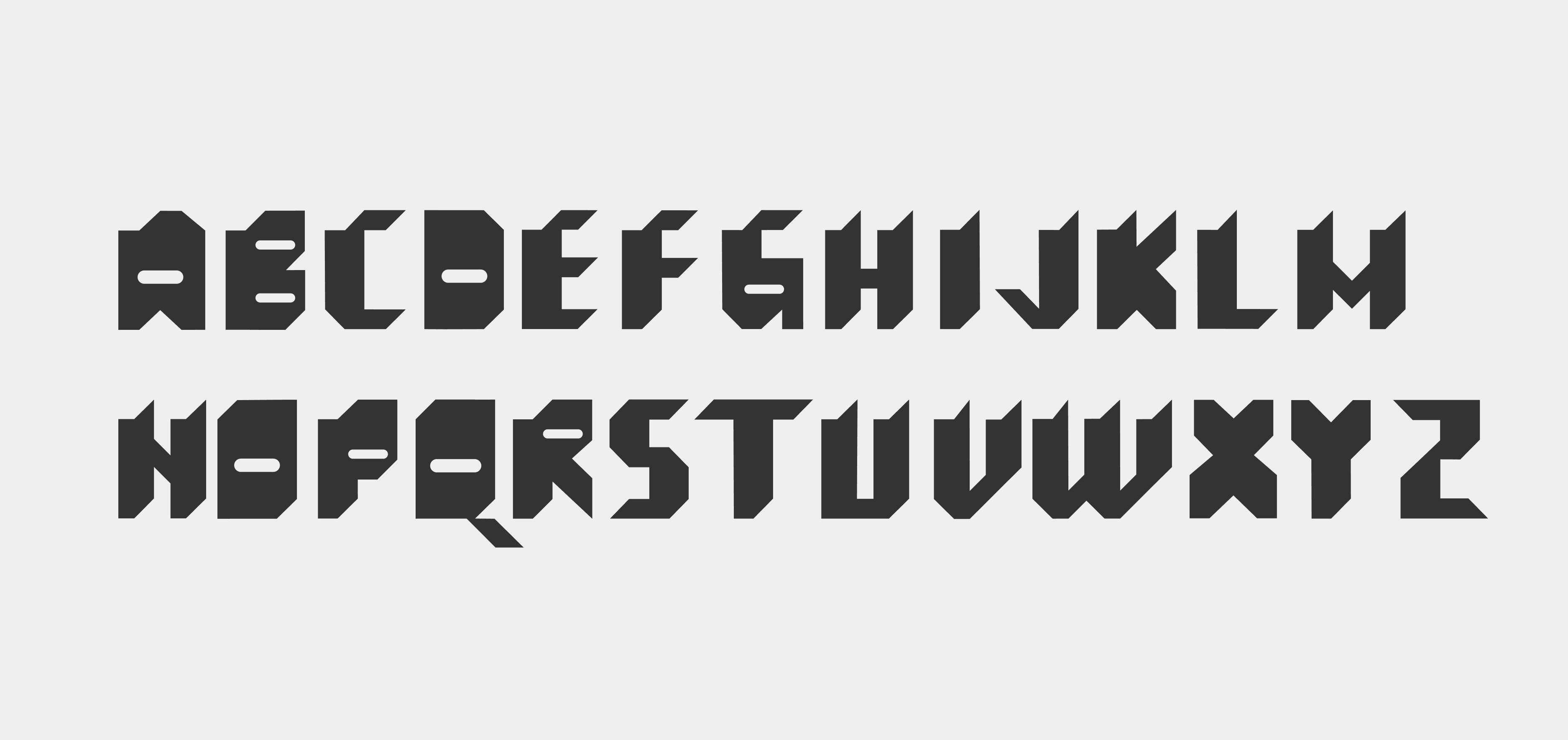
My intent is to design a typeface that praises the movement of brutalism,
where I aim to make a typeface that is based on the shapes of brutalist
buildings.
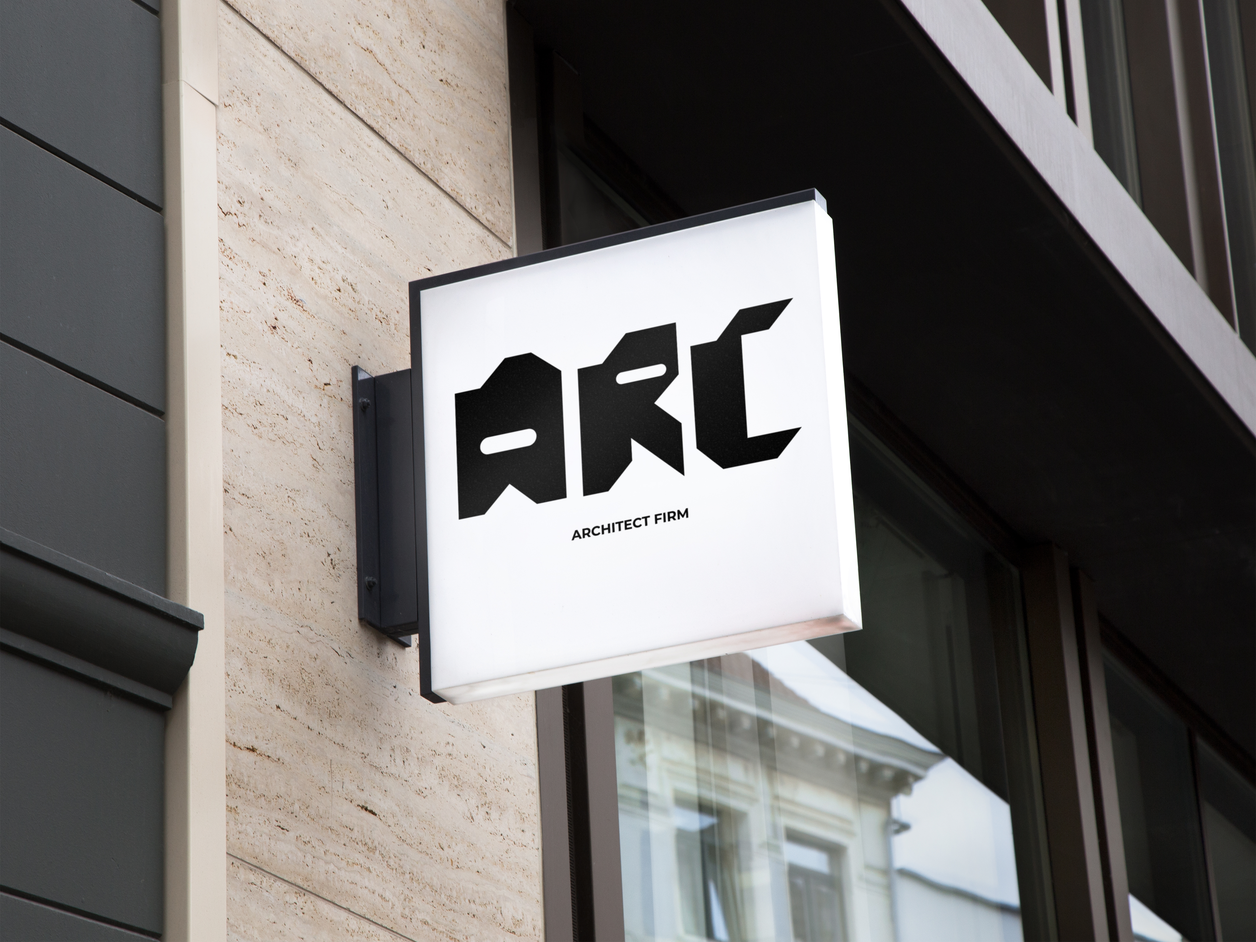
The typeface will be used for a new architecture firm that is new thinking and likes to push the boundaries in architecture.
Typeface design

Other Projects

See Project
→

See Project
→

See Project
→


CONTACT
+47 91 8283 90
jonathan.pirolt@gmail.com
SOCIAL
Behance


Typeface
Corbusier
Brutalism, also known as Brutalist architecture, is a style that emerged in the 1950s and grew out of the early 20th century modernist movement. Brutalist buildings are characterized by their massive, monolithic, and ‘blocky’ appearance with a rigid geometric style and large-scale use of poured concrete. The movement began to decline in the 1970s, has been much criticized for being unwelcoming and inhuman. But it`s a beauty in it and a utopian vibe to the buildings. A freedom to experiment with geometric shapes to provoke and challenge the normal.
My intent is to design a typeface that praises the movement of brutalism,
where I aim to make a typeface that is based on the shapes of brutalist
buildings.
The typeface will be used for a new architecture firm that is new thinking and likes to push the boundaries in architecture.
Typeface design

Other Projects
See Project
→
See Project
→
See Project
→


CONTACT
+47 91 8283 90
jonathan.pirolt@gmail.com
SOCIAL
Behance